
12.2021
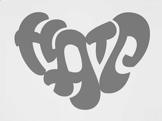
Dynamification of typography
Dynamification of typography
Dynamification of typography (12.2021)
05.2021
KONE custom fonts
KONE custom fonts
KONE custom fonts (05.2021)
10.2020
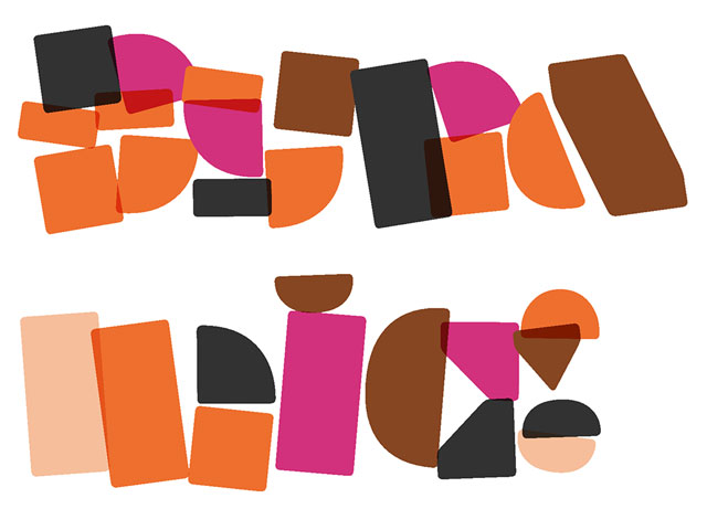
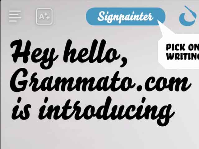
Grammatography
Grammatography
Grammatography (10.2020)
04.2018
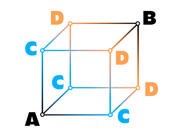
Higher Order Interpolation
Higher Order Interpolation
Higher Order Interpolation (04.2018)
06.2017
Subpixel ASCII+ Art
Subpixel ASCII+ Art
Subpixel ASCII+ Art (06.2017)
12.2015
Everything is black and white
Everything is black and white
Everything is black and white (12.2015)
03.2015
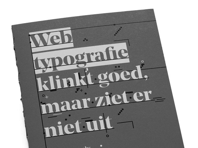
Webtypografie klinkt goed, maar ziet er niet uit
Webtypografie klinkt goed, maar ziet er niet uit
Webtypografie klinkt goed, maar ziet er niet uit (03.2015)
11.2014
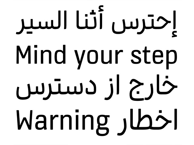
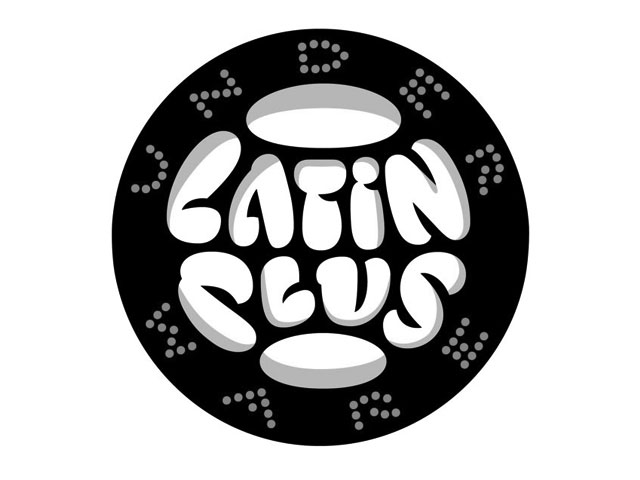
Notes on Latin Plus
Notes on Latin Plus
Notes on Latin Plus (11.2014)
03.2010
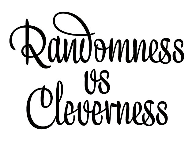
Randomness versus Cleverness
Randomness versus Cleverness
Randomness versus Cleverness (03.2010)
01.2009
New logotype for MyFonts
New logotype for MyFonts
New logotype for MyFonts (01.2009)
New logotype for Daimler (12.2007)
05.2007
Customized fonts for European banks
Customized fonts for European banks
Customized fonts for European banks (05.2007)
Case study: New logotype for Daimler.
December 2007
Underware creates handmade logotype for the German car corporation Daimler, formerly known as DaimlerChrysler – in cooperation with Schindler Parent Identity.
The new Daimler AG logo.
Since the 4th of October Daimler AG is the new official name of the global vehicle company formerly known as DaimlerChrysler. With this new name the company wants to open a new chapter, and at the same moment honoring the tradition as being the inventor of the car.
This operation, code name name-change, was guided by an internal 200 people strong task-group. For making operation name-change possible, DaimlerChrysler had to pay 20 million dollar to Ford, for the rights to use the name.
Three design studios were initially invited to make a proposal for the new corporate identity of Daimler. One of these studios was Schindler Parent Identity in Berlin. They cooperated with international type designers, including Underware, to achieve the best possible solution.
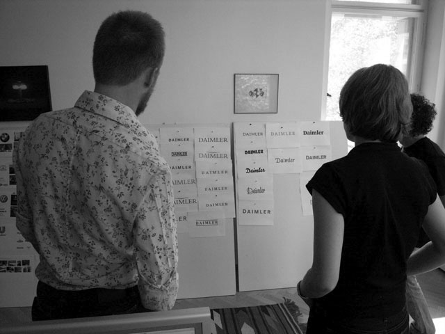
Bas Jacobs from Underware at Schindler & Parent Identity Berlin, discussing some first ideas.
With Underware we found a partner with whom we could develop designs, which were not only according to the brief, but a totally unexpected approach to design for the client. No other typographer in our team (and the teams of the
other agencies) dared to do what Akiem, Bas and Sami did. Although Daimler did not choose for one of the hardrock versions, Underware was able to bring their logo in balance with the ideas of the client. It was a pleasure to work together with people with a sincere attitude.
— Matthias Dietz, Schindler Parent Identity, Berlin
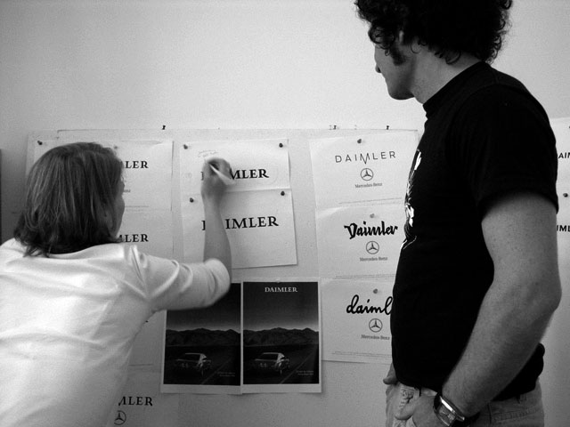
Variations on some basic concepts.
From the dozens of designs presented, Daimler AG chose the design by Underware to be their new logotype. In cooperation with Schindler Parent Identity, Underware fine-tuned the logo, and ultimately delivered the final digital version. Schindler Parent Identity will work on the enormous job to implement the new logo, and create the corporate design around the new brand name.
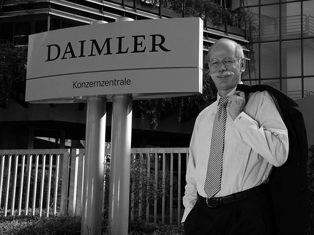
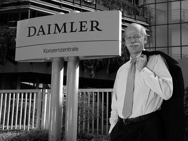
CEO Dr. Dieter Zetsche in front of the Daimler headquarter.
The new trademark from Daimler AG is designed totally from scratch, not based on an existing typeface. The underlying construction is defined by a historical broad nib pen. While using classical proportions, Underware decided to add some unique details; just enough to make the trademarks appearance unique and special, without asking all the attention of the viewer.
In the new corporate identity this logotype will not be accompanied by an emblem or symbol, but stand purely on its own. An outspoken decision for the identity of the most valuable German brand, which employs over 270.000 people.
As typographic specialists Underware is used to cooperate with other agencies on corporate identities. In the past the Dutch-Finnish-German design collective created logotypes in cooperation with other agencies for Masterfile and Thoughtful among others. In addition, Underware has created hand made corporate typefaces for Jyske Bank Denmark and Suunto in close cooperation with local agencies. We are very pleased to get asked by Schindler Parent Identity in Berlin to cooperate on such a specific and sensible typographic problem, says Bas Jacobs from Underware. And above all, satisfied to help Schindler Parent Identity winning the pitch and strengthen their relationship as the corporate design studio of Daimler AG.
For more information, please contact the Underware Custom Type Dept.